The first version of the Variance Commentary Generator worked. It read two GL files. It calculated variances. It filtered for material movements. It called the Claude API. It produced a three-tab Excel file with AI-written commentary on every material variance between FY 2020 and FY 2021.
Then I looked at the output and decided to throw the whole thing away.
This post is about why. About the gap between "the code runs" and "this is good enough to put in front of a CFO." About what seven years in Big-4 audit teaches you to look for in management commentary, and what almost none of it shows up in a v1.
What the v1 actually did
The architecture from Post 2 held up cleanly. Read two periods, sum amounts by Account_key, merge, calculate variance and variance percentage, filter for material movements (more than 1,000 absolute and more than 5%), pass the material list to Claude with explicit "do not invent reasons" guardrails, write three Excel tabs.
Here's the prompt that went to the API on the first run:
prompt = f"""You are a senior finance analyst preparing a year-on-year variance commentary for management.

Below is a summary of material movements between Y0 (2020) and Y1 (2021), pulled directly from the general ledger. All figures are factual, do not invent reasons.

{variance_text}

Write a concise management commentary that:
1. Leads with the most significant movements (revenue, cost of sales, operating expenses)
2. States the actual numbers and percentage changes, do not round or generalise
3. Groups related movements together (e.g. all sales lines together, all cost lines together)
4. Where a movement has a likely direct cause visible in the data (e.g. sales increased and cost of sales increased proportionally), note that connection
5. Where the cause is not clear from the data alone, flag it as requiring management input, do not guess
6. Uses plain finance language, no jargon, no filler phrases
7. Keeps the total length to under 300 words

Format: flowing paragraphs, not bullet points."""
Seven rules. The "do not invent reasons" instruction is in there twice, once in the framing, once explicitly in rule 5. The model used was claude-opus-4-51, max_tokens=1000, target output around 300 words.
And it worked.
What the output looked like
Three Excel tabs. The first was the commentary itself, with a header block, the AI-written narrative, and a "what was considered" metadata section explaining the materiality filter and the model used.
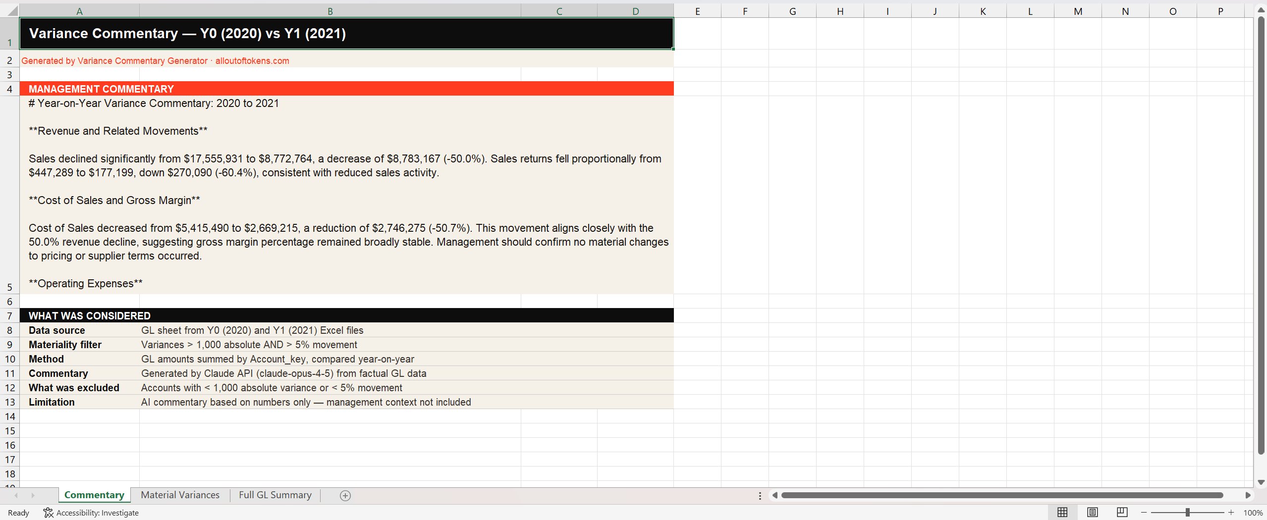
Reading it back: the numbers are right. Sales declined 50.0% from $17.5m to $8.8m. Cost of Sales fell 50.7%, broadly proportional. The commentary even flags that gross margin remained stable as a result. Management context is correctly called out as missing rather than invented. There's a methodology block explaining what was considered and what wasn't. By the standards of "AI tool that wrote a thing", this is fine.
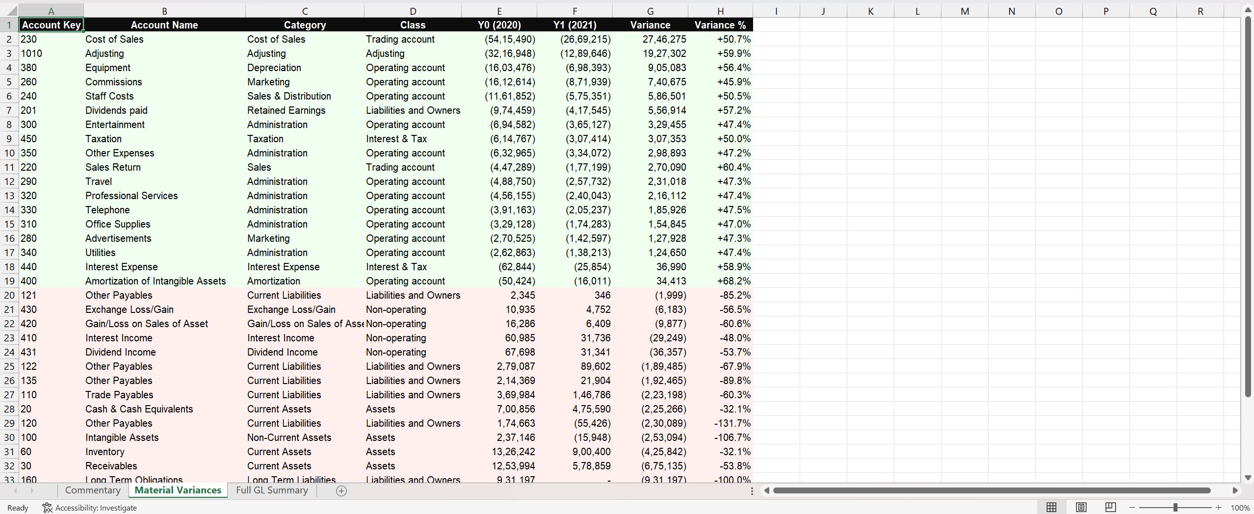
The second tab listed every material variance, colour-coded green for favourable and red for adverse:
The third tab was a full GL summary, every account whether it passed materiality or not, available for anyone wanting to verify what was filtered out.
Three tabs. Real numbers. AI commentary that didn't make things up. By any reasonable definition, the tool worked.
Why I threw it away
Seven years of Big-4 audit, sitting across from controllers, finance directors, and audit committees, teaches you a specific thing about variance commentary: the format that gets signed off by a board does more than describe movements. It connects them.
A board pack reader doesn't want a list of accounts with arrows. They want the story the numbers are telling about the business. If profit went up year-on-year, the shareholders' equity section of the balance sheet should reflect that increase, because profits flow into reserves. That's a coherence check, not a finding. If it doesn't hold, something is wrong, either in the numbers or in the explanation. A good commentary either confirms the connection or explains why it isn't there (dividends paid, share buybacks, prior-year adjustments).2
Same logic everywhere. If cash decreased materially, you'd expect to see either a corresponding investment (a jump in property, plant and equipment), a debt repayment (a drop in long-term liabilities), or a dividend (a movement through retained earnings). If revenue jumped because of a new production line, the depreciation line on operating expenses should reflect the new asset, even if some of the related costs aren't capitalised. The accounts are connected. Real commentary surfaces the connections.
The v1 didn't do any of that. It described each material movement in isolation, in finance-grammatical English, sourced entirely from a flat table of variances. It couldn't cross-reference the P&L against the balance sheet. It couldn't trace a revenue movement back to the GL transactions that drove it. It couldn't spot when two changes implied a third. It couldn't tell a story.
A junior analyst with a calculator could produce something equivalent in an afternoon. That's a useful benchmark. If a tool only gets you to "junior analyst with a calculator", the tool isn't earning its place in the workflow.
Real commentary surfaces the connections. The v1 described each variance in isolation, in finance-grammatical English. It couldn't tell a story.
What good actually looks like
So I stopped building and started writing down what a board-grade commentary tool would actually need to produce. Not from generic AI-finance writing, from what I'd seen sit on the desks of CFOs and audit committee chairs over seven years.3
The list ended up looking something like this.
None of this is exotic. Every item on that list is something a competent FP&A team produces every quarter. The point of the tool isn't to invent a new format. It's to take a working format that takes a small team a week and produce a first draft of it from raw GL in twenty seconds.
The v1 wasn't producing that format. It was producing a thinner, less connected version of one slice of it. Which is why it had to go.
What's coming in Post 4
v2 was the rebuild. Nine Excel tabs instead of three. A waterfall bridge chart. A transaction trail with the top GL movements per material account. A balance sheet flux tab. An opex breakdown. A methodology tab. An interactive HTML dashboard alongside the Excel. Hundreds of new lines of Python.
Post 4 walks through that build. What stayed from v1. What had to be torn out. The places where the prompt itself had to grow from seven rules to a structured spec with four required sections. And the parts that, even now, the tool can't do, which is what Post 5 is for.
Notes
- claude-opus-4-5 was the model used in v1 and continued through to the current version. Earlier in the build I tested the same prompt against claude-sonnet-4-5 to see if a smaller, faster model could carry the work. It could, on clean rows, but it was less reliable on edge cases (zero variance lines, accounts with missing prior-year values). Opus stayed. ↩
- The cleanest articulation of this I've encountered is in audit training: every figure on the balance sheet has a counterparty somewhere else in the financial statements. Profit ties to retained earnings. Cash ties to the cash flow statement. Fixed-asset additions tie to investing activities. A variance commentary that doesn't traverse these connections is doing description, not analysis. ↩
- For anyone wanting a public reference: the IFRS Foundation's Management Commentary Practice Statement sets out what good commentary should contain. It's principles-based rather than prescriptive, but the four pillars (resources and relationships, risks, results and prospects, and performance measures) map almost directly to the gaps the v1 had. ↩
Next post: the v2 rebuild, the nine-tab output, the prompt that grew with it, and what changed when the tool stopped describing variances and started connecting them. Find me on LinkedIn if you want to follow along, or if you've built something similar and want to compare notes.