Post 3 ended on a hard sentence. The v1 wasn't earning its place. A junior analyst with a calculator could match it. The tool described variances in isolation, never connected the dots between the P&L and the balance sheet, and produced a deliverable a finance director would hand back without reading.
This post is what came next. The rebuild that took the v1 from three tabs to nine, from 250 lines of Python to 1,388, from one prompt rule to four mandatory section headers.1 Multiple iterations, several broken charts, a long fight with sign conventions, and one design choice in the AI prompt that turned the most-feared weakness of LLMs into the most useful feature of the tool.
I'll walk through the changes in the order I'd want a finance reader to encounter them. Then the part that surprised me. Then what's coming in Post 5.
claude-opus-4-5 at max_tokens=1,500
What landed when you opened the file
First thing the reader sees on Tab 01: the headline P&L numbers laid out as KPI tiles, with delta arrows, prior-year comparisons, and a written executive summary directly below. No scrolling, no hunting, no reading prose to find the number. The numbers are right there. The narrative explains them.
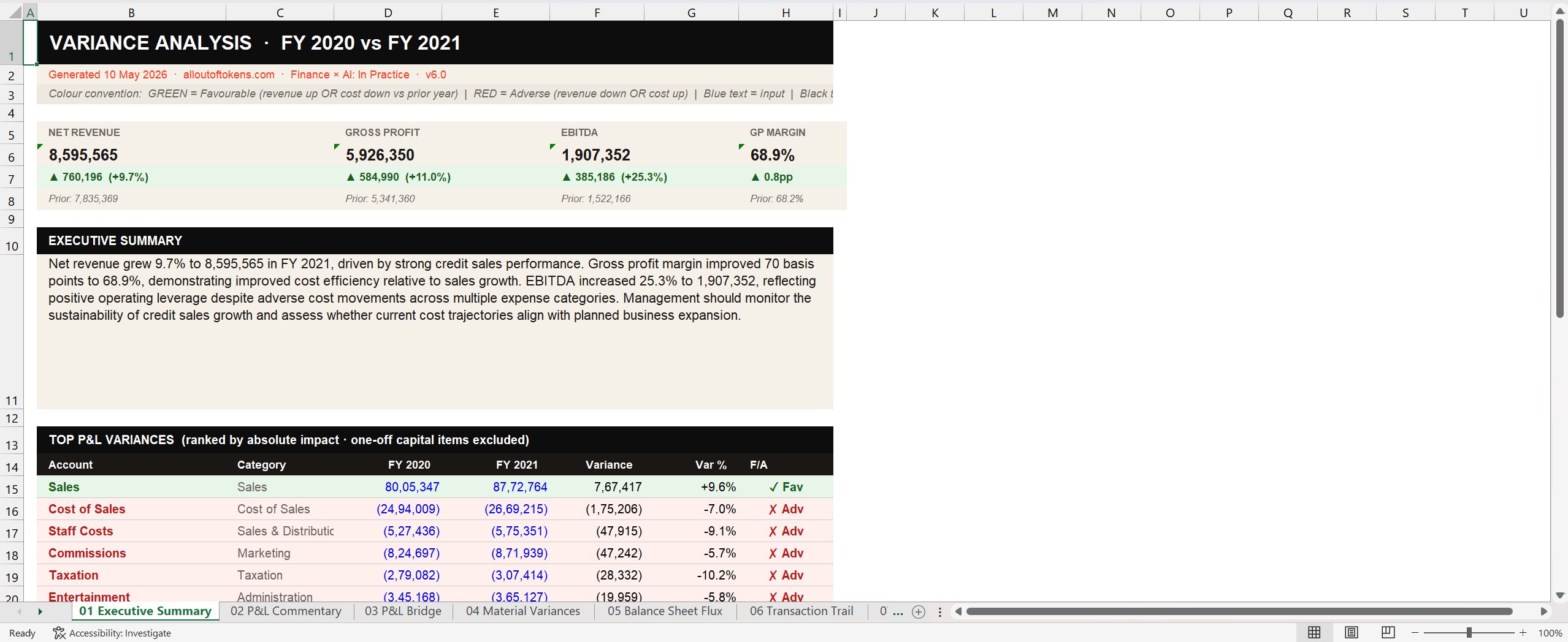
v1 had nothing like this. v1 dropped the reader into a single block of narrative text. vfinal opens with a structured visual answer to the implicit board question: how did we do this year, and how does it compare to last? That question is answered before the reader has read a single sentence.
Materiality became tiered
v1 treated materiality as one rule for everything: variance above 1,000 absolute and above 5%. Both conditions had to be met. That's defensible for a sample exercise. It's not defensible for a real chart of accounts where the sensitivity of a 5% movement varies enormously by account type.
vfinal switched to a tiered table. Sales and Cost of Sales need wider thresholds because they're large numbers and a 3% movement is already meaningful. Depreciation needs a tighter percentage threshold because the absolute numbers are small but the line is highly visible to auditors. Balance sheet accounts need much higher absolute thresholds because the values are bigger by orders of magnitude.
THRESHOLDS = {
    "Sales":                       {"pct": 3.0,  "abs": 10000},
    "Cost of Sales":               {"pct": 3.0,  "abs": 10000},
    "Sales & Distribution":        {"pct": 5.0,  "abs": 5000},
    "Marketing":                   {"pct": 5.0,  "abs": 5000},
    "Administration":              {"pct": 5.0,  "abs": 5000},
    "Depreciation & Amortization": {"pct": 2.0,  "abs": 500},
    "Interest & Tax":              {"pct": 5.0,  "abs": 5000},
    "Non-operating":               {"pct": 5.0,  "abs": 1000},
    "Balance Sheet":               {"pct": 10.0, "abs": 50000},
    "DEFAULT":                     {"pct": 5.0,  "abs": 5000},
}
This is also how a Big-4 audit team actually scopes materiality. Different account categories carry different sensitivities, and a single number across the whole ledger is a sign someone hasn't thought about it. The dictionary is configurable2, sits at the top of the script, and gets reproduced verbatim into the methodology tab so any reviewer can audit the choices.
The sign convention had to be hardcoded into the prompt
In a standard GL, costs are stored as negative numbers. A cost decrease shows as Var > 0 because Y1 is less negative than Y0. A model trained on general English doesn't know this. Ask it about a +47,915 movement on Staff Costs, it'll call it adverse, because in plain English "+" reads as "more". In the GL convention, that movement is favourable: staff costs went down.
v1 didn't address this. The output was occasionally wrong about direction in a way that would have humiliated anyone who took it to a board. vfinal has a paragraph in the prompt dedicated to this single point:
ALL cost accounts are stored as NEGATIVE numbers in this GL.
A FAVOURABLE variance on a cost account means Variance > 0
(cost decreased).
An ADVERSE variance on a cost account means Variance < 0
(cost increased).
Three sentences. Built explicitly into the prompt context for every API call. The model now reads "+47,915 on Staff Costs" and labels it favourable. The Excel output applies the same logic in Python: green for any account where Var > 0, red for any account where Var < 0. Prompt and code agree. Reviewer's eye doesn't have to flip the sign.
Drilldown via the Transaction Trail tab
The biggest functional gap in v1: a reader couldn't ask "where did this number come from?" without going back to the source files. vfinal closes that gap with a dedicated tab that explodes every material variance into the GL transactions that drove it.
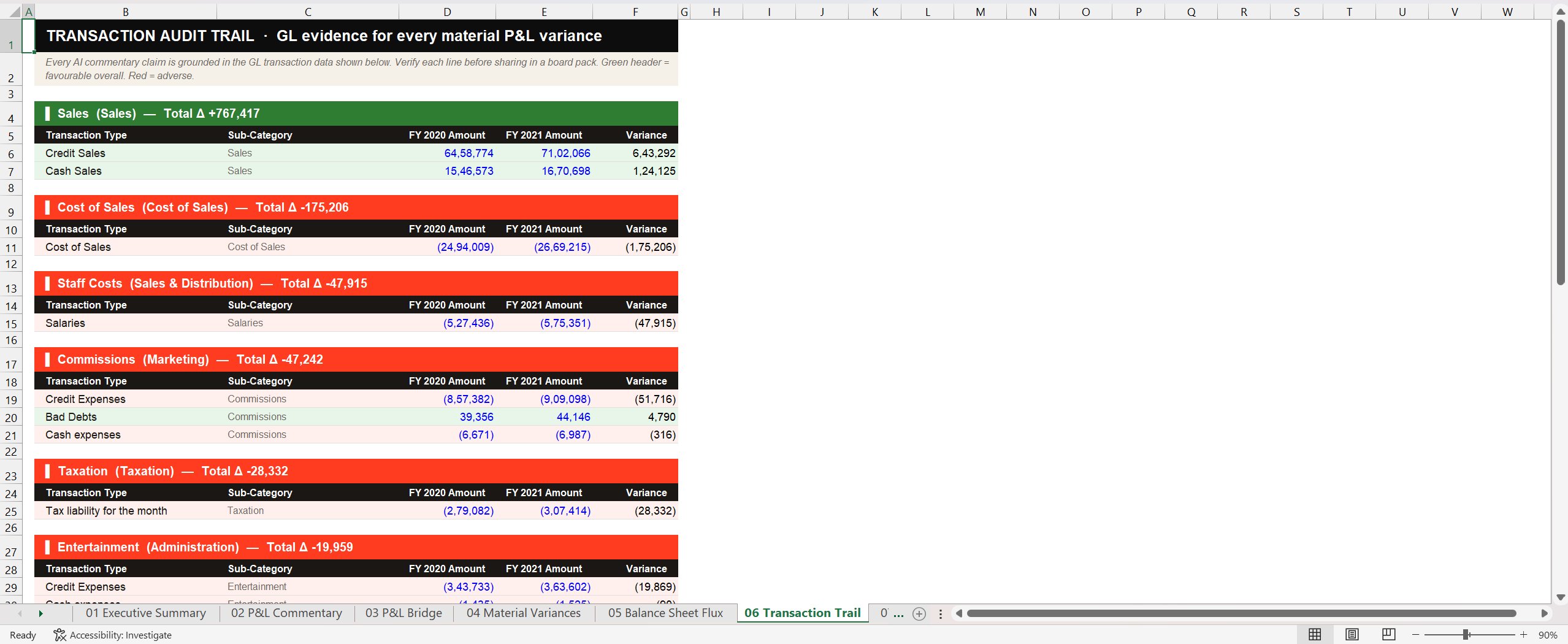
This is the tab that earned the loudest reaction when I showed it to colleagues. It's not particularly clever. It's just a careful aggregation of the underlying GL transactions, sorted and presented in a form a reviewer can scan. But it's the difference between "the AI said this" and "the AI said this and here's where the number lives." That difference is everything in finance.
A specific bug worth flagging: the Sub-Category column on this tab kept turning up empty in early iterations. The data was there, the column was rendering, but the values were blank. The issue was a chart-of-accounts column called SubAccount that the script needed to read but wasn't being merged in correctly. Fixing it took most of an afternoon. Generic statement: half the rebuild was making columns show what they were supposed to show. None of it is impressive. All of it is the difference between a tool that works and a tool that doesn't.
Cross-statement coherence: the bridge and the balance sheet
Post 3 made an argument about connectivity. Real commentary does more than describe variances in isolation. It surfaces the connections between them. Two tabs in vfinal exist to make those connections concrete.
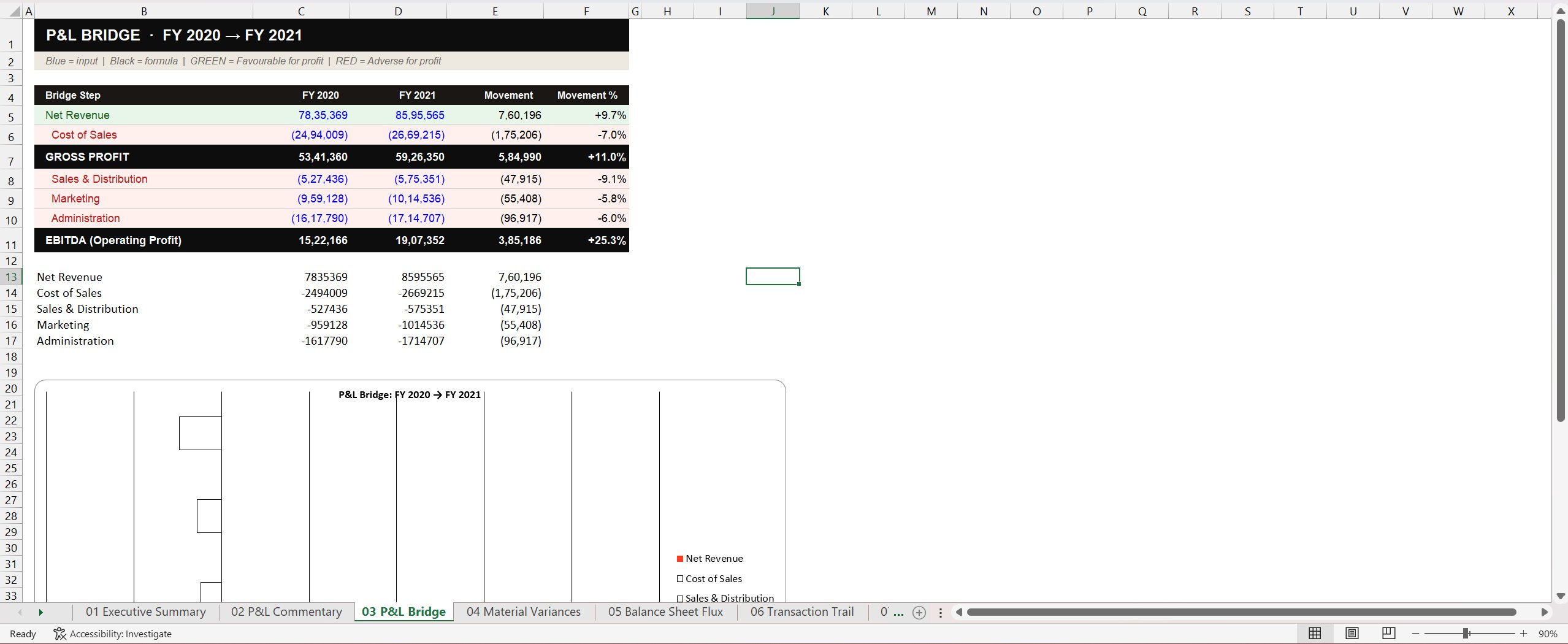
The first is the P&L Bridge, which walks line by line from Net Revenue down to EBITDA. Each line shows Y0, Y1, the movement, and the percentage. There's a waterfall chart at the bottom of the same tab. A finance reader can see in twenty seconds where the EBITDA movement came from before reading a single sentence of the AI narrative.
The second is the Balance Sheet Flux tab. Every balance sheet account, with movement, percentage, and a status note. One-off events (share capital movements, long-term liability settlements) are flagged separately. Below-materiality movements are explicitly labelled "no action required" rather than being hidden, because hiding them would cost the reviewer the ability to verify what wasn't acted on.
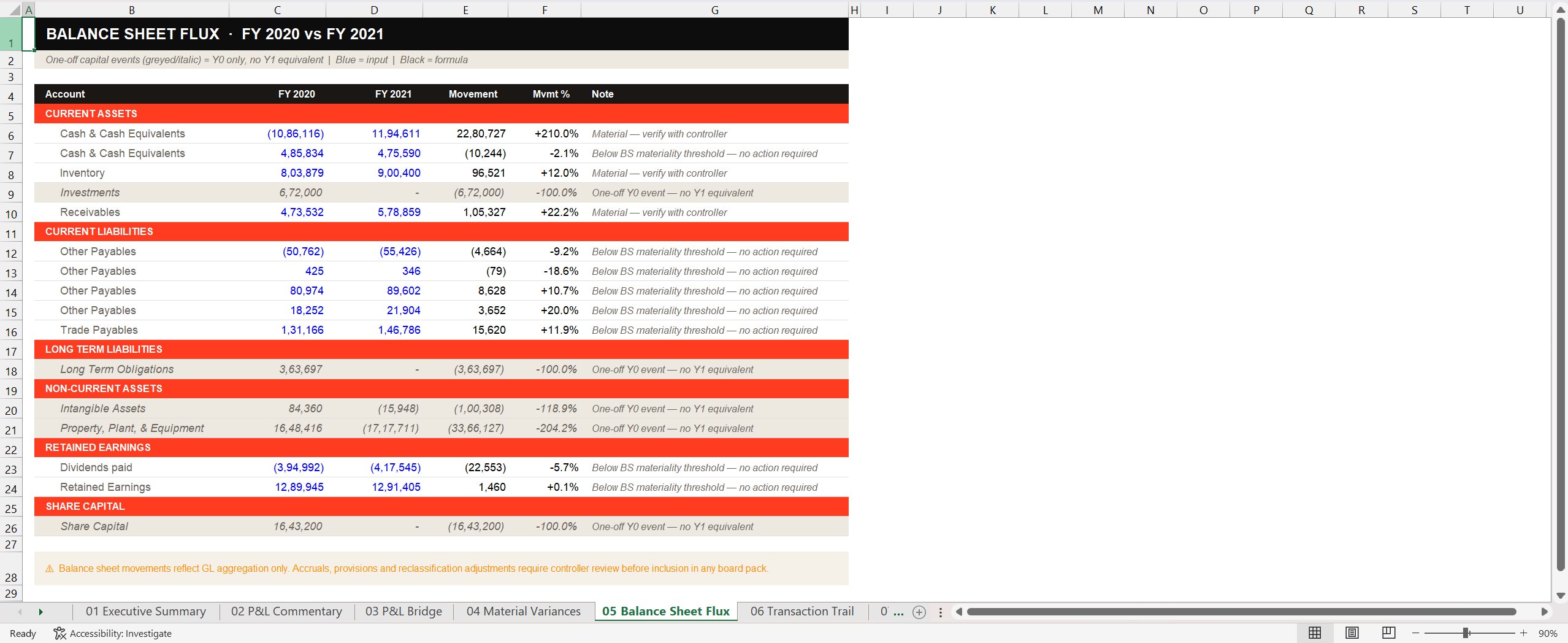
A reader can now hold the P&L tab next to the BS Flux tab and check the connections from Post 3. Did profit increase? Yes, EBITDA up 25.3%. Did retained earnings move accordingly? Tab 05 shows retained earnings at +0.1%, flagged as below threshold. The connection isn't holding cleanly, which means something happened (a dividend, a reclassification) that warrants a controller's attention. That's exactly the kind of cross-statement question a board reader is supposed to ask. The tool surfaces it without claiming to answer it.
The unglamorous middle
Between v1 and vfinal there were several iterations. None of them were architectural. All of them were the kind of thing nobody talks about because it isn't impressive but is exactly where building actually happens.
is_fav function had inconsistent logic between the colour rule and the label rule. Fixed with a single universal rule: Var > 0 is favourable for every account, given the GL stores costs as negatives.SubAccount column wasn't being passed through the merge step. The transaction-type column populated correctly but the granular sub-category was blank. Fixed by adding the column to the lookup map.This is the part of building that nobody puts in a LinkedIn post. It's also where the tool actually became usable. Each one of these took an afternoon to find and ten minutes to fix. The architecture from Post 2 held throughout. The failures were at the edges. They always are.
The prompt that came out of it
v1's prompt was seven rules in flowing prose. vfinal's prompt is structurally different: it requires four exact section headers, with explicit length and format rules for each.
Write commentary using EXACTLY these four section headers
(no extra ## headers):

## EXECUTIVE SUMMARY
One paragraph, max 75 words. State net revenue growth, GP margin
direction, EBITDA movement. End with one forward-looking sentence.

## REVENUE AND GROSS MARGIN
2-3 paragraphs. Decompose sales movement using driver data. Explain
cost of sales relative to revenue. Where the cause cannot be
determined from GL data, write "requires management input."

## OPERATING EXPENSES
2 paragraphs. Group by category. State what changed, by how much,
and what the driver data suggests.

## MANAGEMENT INPUT REQUIRED
Numbered list of exactly 5 items. Each references a specific account
and variance amount.
Format: N. Account Name (Δ amount): specific question

RULES: No markdown bold or italic. Plain text only.
Every claim traceable to the data above.
The shift is from describing what good looks like to dictating structure. The model has less freedom and produces more consistent output. The reviewer always knows where the executive summary ends and the operating expense section begins, because the prompt forces those boundaries.
This is also the principle from Post 2 made concrete: structural instructions beat quality adjectives. "Write good commentary" produces inconsistent results. "Write a 75-word paragraph stating these three metrics in this order, ending on this kind of sentence" produces commentary that fits into a board pack template the reader has seen a hundred times before.
The one thing that surprised me
The fourth section header is the one I want to spend the rest of this post on, because it's the part of the build that genuinely changed how I think about AI in finance.
Most of the conversation about LLMs in finance for the last two years has been about hallucinations. AI tools confidently fabricating reasons. AI commentary inventing market conditions and cost drivers and customer trends with no basis in the data. The dominant criticism, the one every finance director raises within five minutes of any AI demo: "but how do I know it's not making things up?"
The fix isn't a smarter model or a tighter "do not invent" rule. It's giving the model somewhere productive to put its uncertainty.
v1 fought hallucinations with a constraint: do not invent reasons. Which works on the cases the rule covers. But "do not invent" is an instruction about what not to do. It tells the model to stop, without telling it what to do instead. When the model hits a variance it can't explain from the data alone, the constraint just produces vague hedging or nothing at all.
The Management Input Required section flips this. Instead of constraining the model away from a bad output, it gives the model a productive job for the cases where it doesn't have enough context. When you don't know, surface five specific questions for a human reviewer, each tied to a specific number. The constraint becomes a deliverable.
The output looks like this in Tab 01 of the Excel:
A finance director reading the commentary now gets two things. First, the AI's best attempt at narrative based on the data it has. Second, a structured list of five questions the AI couldn't answer, each tied to a specific account and amount, that the controller is now expected to address. The tool isn't pretending to know everything. It's surfacing exactly where its knowledge ends.
This is what makes the tool feel grown-up to a finance audience. Most AI demos fail because the AI is confident about everything. This one ends with five honest questions. The reviewer doesn't have to play "spot the hallucination." The tool has already drawn the line for them.
The design choice didn't come from engineering. It came from audit. Every audit reviewer carries the instinct of "what would I ask the client about this number?" and the Management Input Required section is just that instinct made explicit in the prompt.3 The AI surfaces five questions because that's what a thoughtful auditor would surface. The tool's biggest weakness (limited context) becomes its most useful feature (a structured questionnaire for the controller) by reframing what we're asking the model to do when it hits its limits.
What's coming in Post 5
Post 5 is what the tool still can't do. The hallucinations that survived. The places where the GL alone isn't enough. The cases where structural prompting and tiered materiality and a transaction trail get you to "useful first draft" but not to "ready for the audit committee." Worth a separate post because the limits of the tool are the most honest thing I can write about, and the part most likely to help anyone else trying to build something similar.
There's also a separate companion piece coming: a step-by-step install guide for finance professionals who want to run this tool on their own laptop without a coding background. That'll live on the repo and be linked from each post. The series is meant to be readable and useful in equal measure.
Notes
- vfinal is internally labelled v6.0 in the script. Six is the iteration count, not a marketing version. The earlier numbered versions covered the bug fixes in the iteration log above plus a few that didn't make this post. Naming convention: vfinal is what's running now and what's in the public repo. ↩
-
The materiality threshold table is configurable, sitting at the top of
analyse_template.py. A finance team using this tool against their own GL would adjust the absolute and percentage values to match their own risk tolerance. The current values are calibrated to the sample dataset. ↩ - The Management Input Required pattern has a name in the LLM literature: it's a form of structured uncertainty surfacing, related to but distinct from chain-of-thought prompting. The version in this tool is unusually concrete because finance reviewers want specific numbers tied to specific questions, not generic confidence scores. ↩
Next post: what the tool still can't do, and why those limits matter more than the capabilities. Find me on LinkedIn if you want to follow along, or if you've built something similar and want to compare notes on the management-input-required pattern.

1. Cost of Sales (Δ -175,206): What pricing or vendor changes drove the 7.0% increase? Was there a one-off cost adjustment in Q4?
2. Staff Costs (Δ -47,915): Did the sales compensation structure change, or did the increase track sales volume?
3. Commissions (Δ -47,242): What proportion of the increase relates to bad debt provisions versus credit sales activity?
4. Cash & Cash Equivalents (Δ +2,280,727): What drove the 210% increase in cash position? Was this operational, financing-related, or a one-off receipt?
5. Receivables (Δ +105,327): Was the 22% increase driven by sales growth or a deterioration in collections?